
.webp)


This week's threads
All the threads →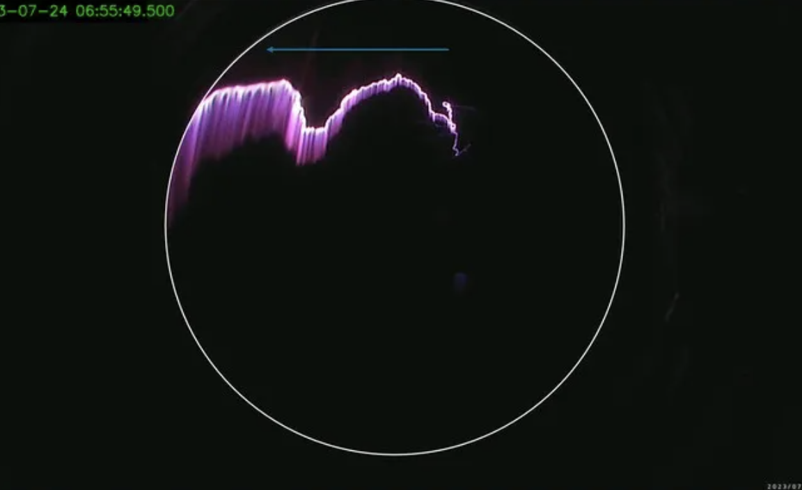

Timothy Lang
Research /
Books /
Timothy Lang
The evidence was overwhelming; an upward lightning discharge from the top of the storm had hit the ER-2.
Months after a campaign hunting gamma-ray flashes, a researcher spotted pulses too fast to come from inside a cloud. A camera that usually showed only black at night turned out to hold the first record of such a strike.
Detection and Analysis of an Upward Jet-Like Electrical Discharge Intercepting a High-Altitude Research Aircraft
20261025-lang-detection-and-analysis-of-an-upward-jet-like-electrical-discharge-intercepting-a-high-altitude-research-aircraft-the-wide-angle


Geoff Tomaino
Research /
Books /
Geoff Tomaino
People Don’t Want to Argue with AI, and That Makes Them More Persuaded by It
When people believe they are talking to an AI rather than a person, they push back less and change their minds more. The persuasive edge comes from the listener, not the machine.
From People to Prompts
20261024-tomaino-from-people-to-prompts-in-a-nutshell
%20copy.png)
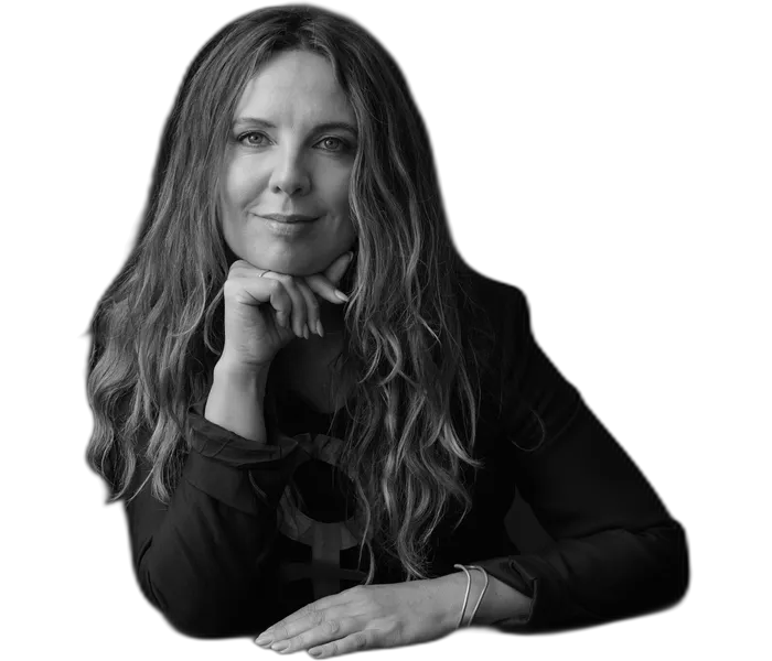
Sine Plambech
Arts /
Books /
Sine Plambech
A very powerful woman's story
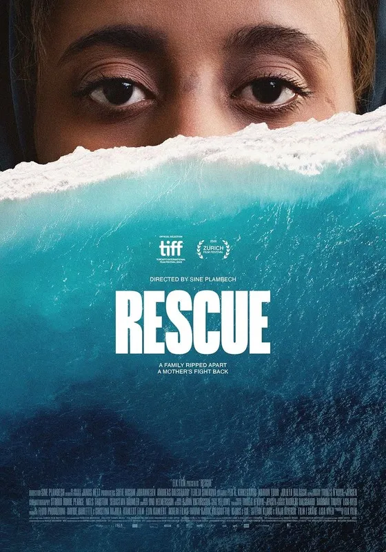
Filming a year aboard a Doctors Without Borders ship, an anthropologist witnessed a militia seize women and children at sea. The film follows one family through what came next, and traces the European money behind the kidnapping.
Rescue
20261023-plambech-rescue-in-a-nutshell

Yucheng Lin
Research /
Books /
Yucheng Lin
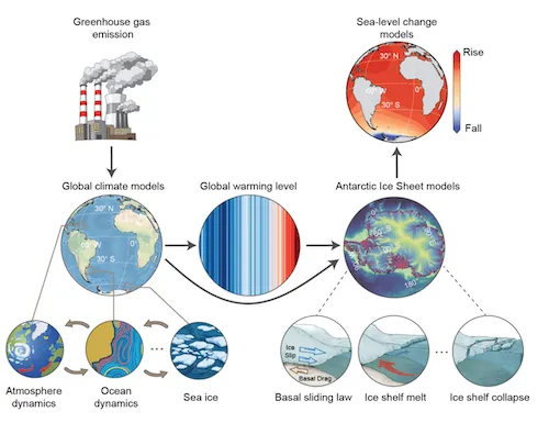
Even at 1.5 °C, Antarctica loses ice this century. How much is our choice.
One chart of projections that could not agree on whether Antarctica would raise or lower the seas set this work in motion. A chain of models, each adding blur, explains the disagreement. A fast emulator checked against two decades of gravity measurements from space cuts through it.
Committed Antarctic Ice Sheet mass loss by the end of the twenty-first century
20261022-lin-committed-antarctic-ice-sheet-mass-loss-by-the-end-of-the-twenty-first-century-the-wide-angle
Charlie Parr
Arts /
Books /
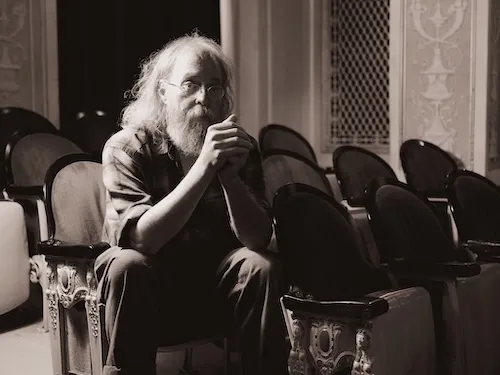
Charlie Parr
I didn’t write this about the world, I wrote it about myself.
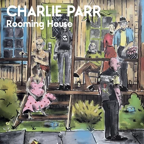
A folk opera imagines a kitchen table where neighboring is a verb, empathy is not a bad word, and money does not decide who gets care. Everyone gets a seat.
Rooming House
20261022-parr-rooming-house-in-a-nutshell
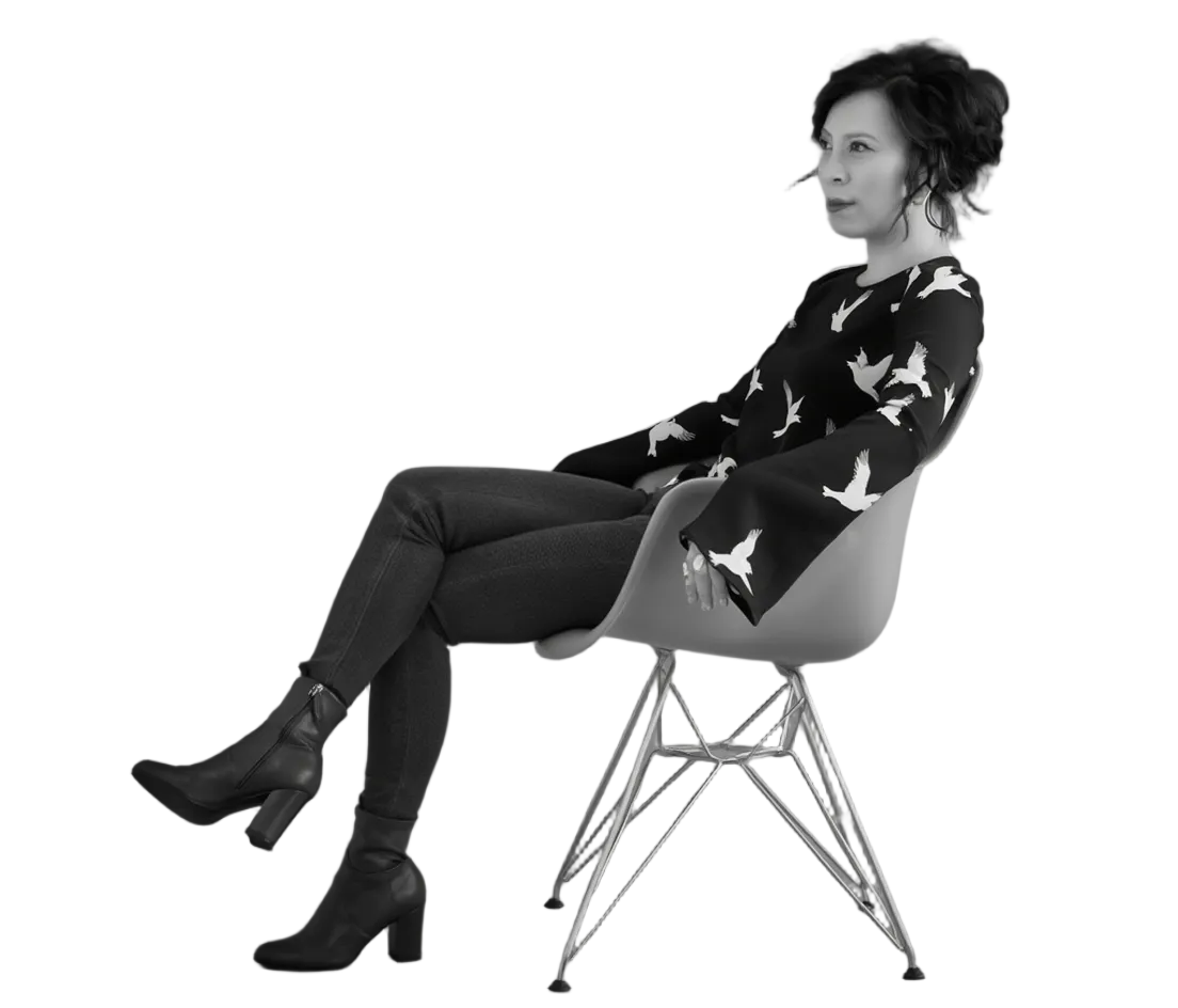
Theory of the Gimmick
Know something the rest of us don't?
Most threads on Rorotoko begin with our invitation. Any thread can begin with a proposal: you write it with the same prompts every thread answers, and we review it.
Propose a thread →